Write styled HTML sections - cards, callouts, fancy lists, steps, timelines, grids and more - using a simple `!!! type` ... `!!!->` markdown fence.
| Links: | |
|---|---|
| Maintainers: | madusankabibile |
| Version: | 1.4.2 |
| Minimum app version: | 3.1.0 |
| Downloads: This version: | 141 |
| Last updated: | 2026-09-22T20:33:48Z |

Write styled HTML sections in your notes with a simple markdown fence. No HTML, no inline CSS.
!!! card_light_blue My card title
Card contents, with the usual **markdown** you'd expect.
!!!->
...renders as a light blue card in the note viewer, in exported HTML and in PDF exports. 383 block types are included, in 34 categories: the twelve classic admonitions, cards in eleven styles, callouts, twenty-two list styles, steps, timelines, stat tiles, progress bars, ratings, tables, pros and cons, FAQs, feature grids, chat transcripts, grids, banners, collapsible sections - plus charts (columns, bars, pie, donut, line, area, gauges), flow charts and trees, button rows, ASCII and big-text art, and a set of CSS animations.
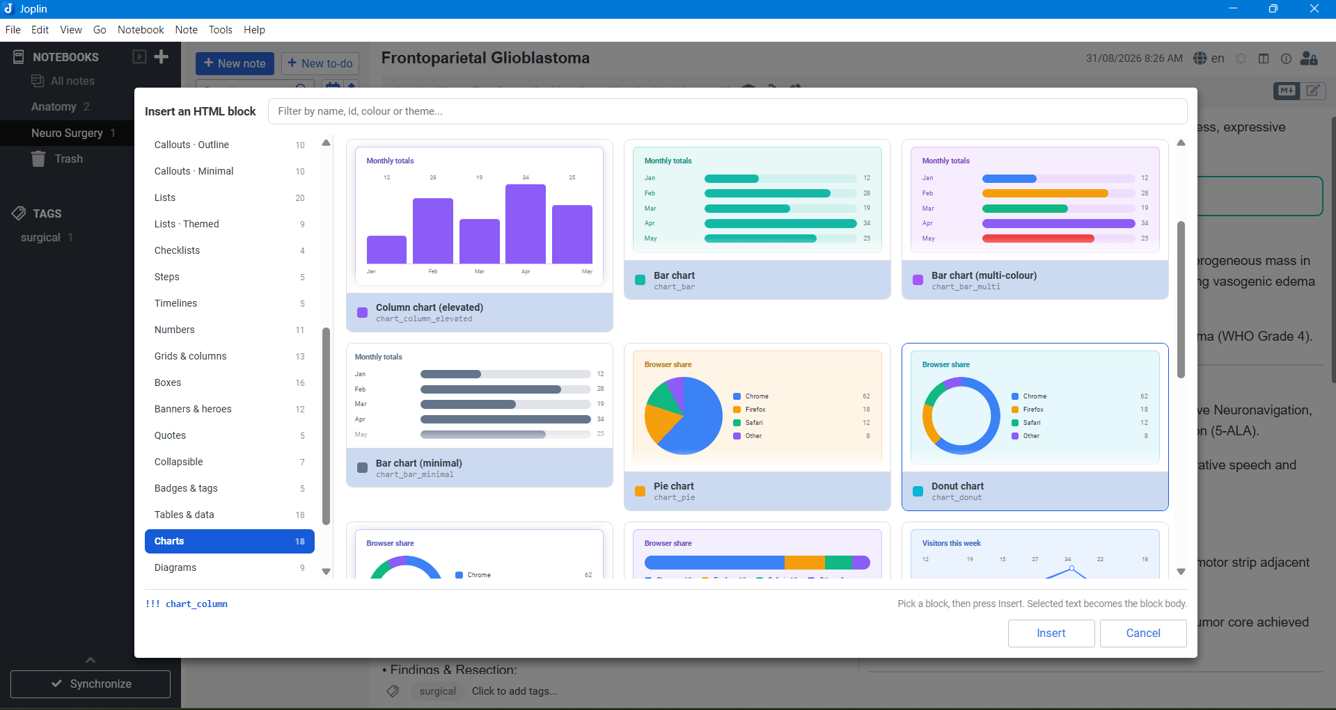
Charts and diagrams are drawn in plain CSS - no script, no images, no external libraries - so they render the same in the viewer, in the picker preview and in a PDF export, and they follow your Joplin theme like everything else.
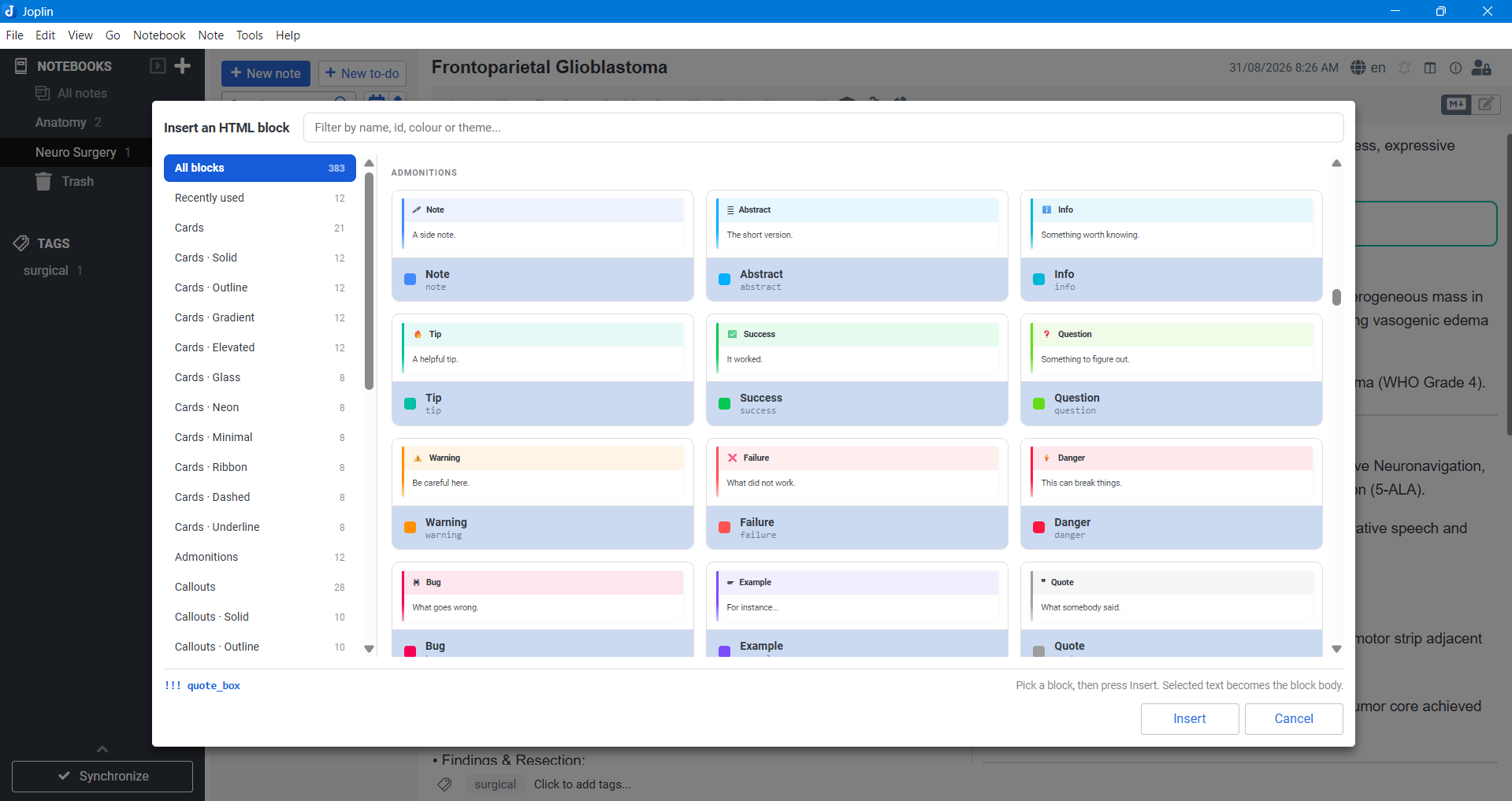
The twelve admonitions, styled to match the Admonition markdown extension so existing notes migrate unchanged.
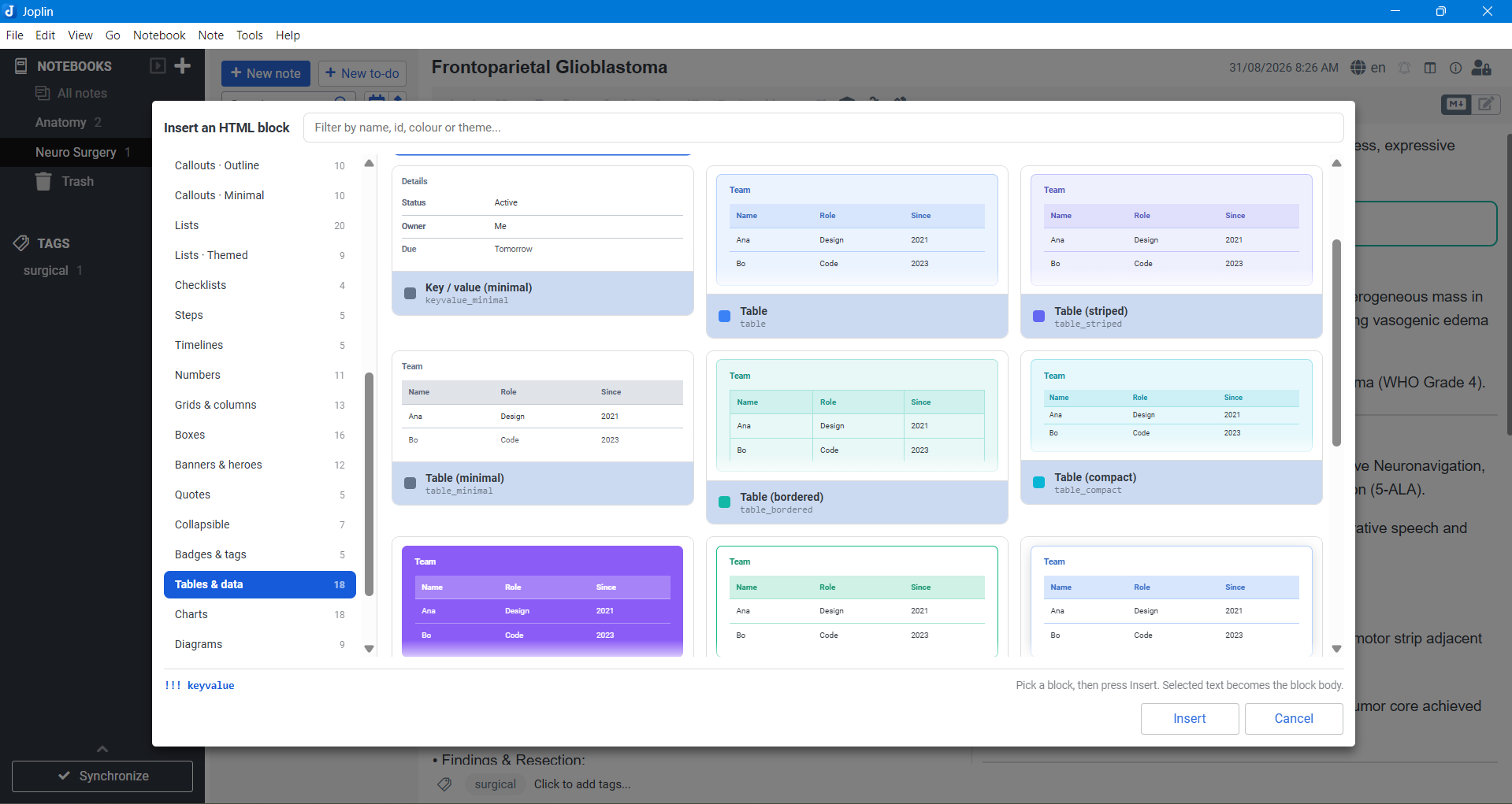
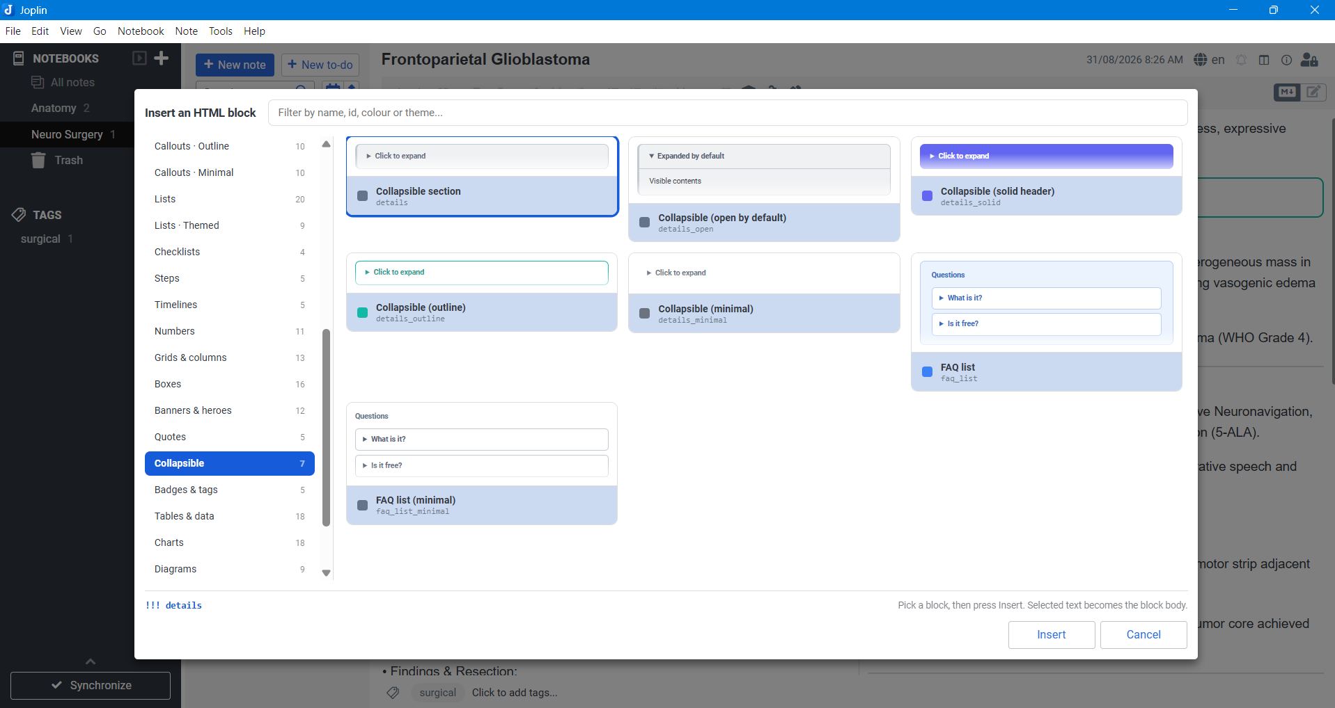
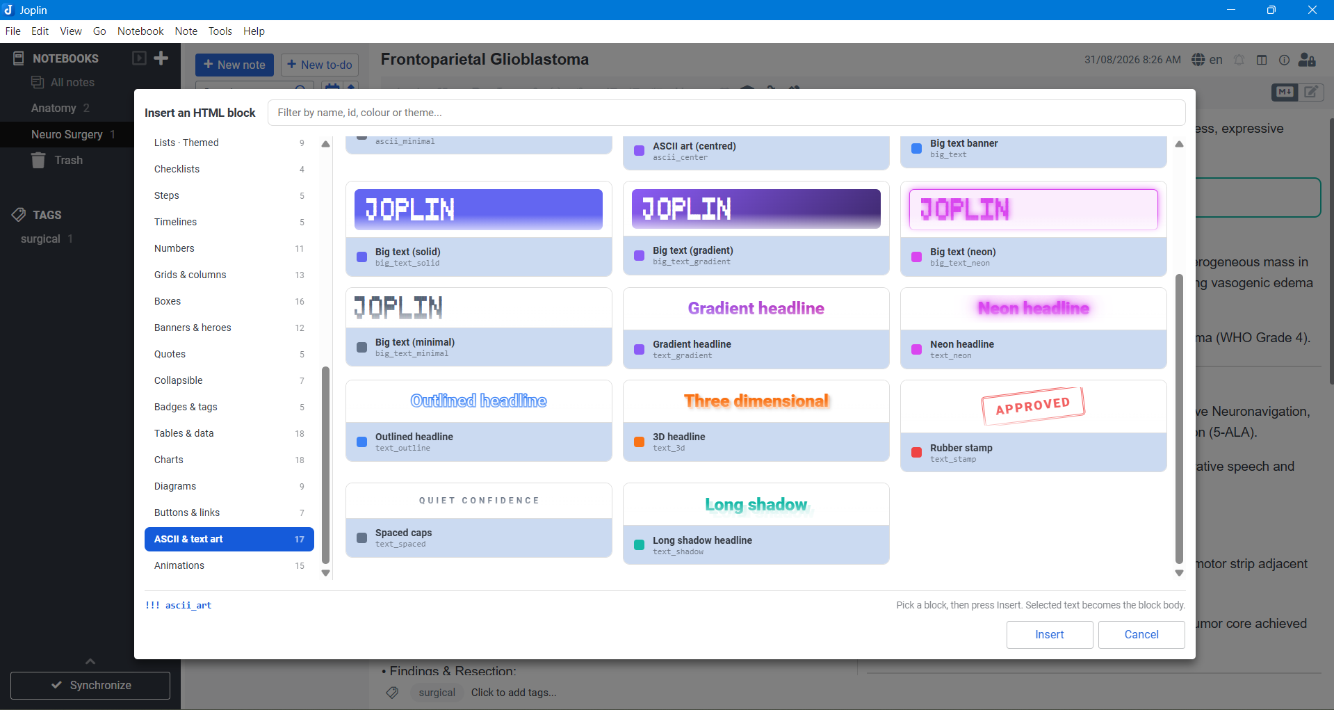
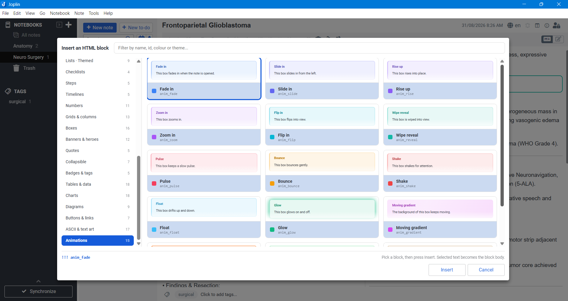
The picker: filter 383 blocks by name, id, colour or theme, and insert one with a click. Every tile is a live preview, not a drawing.
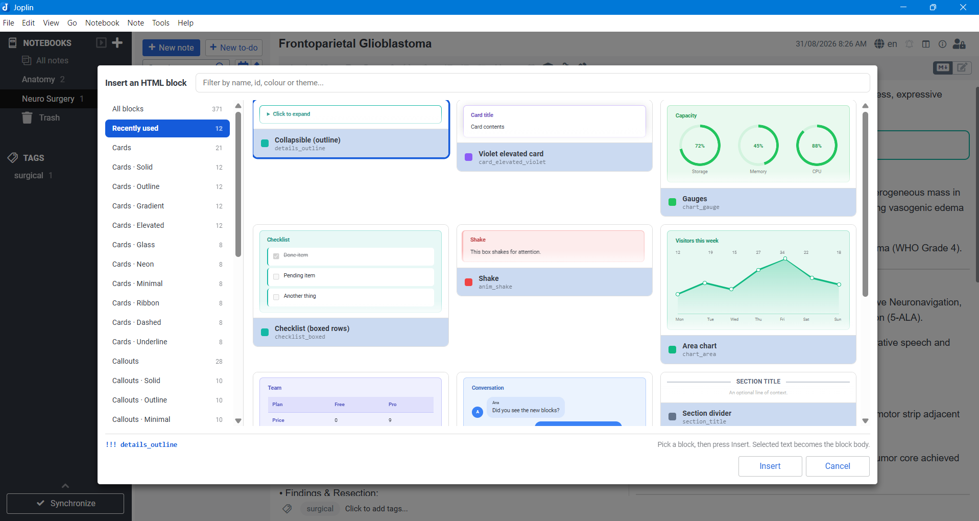
Columns, bars, pie, donut, line, area and gauges - all plain CSS, no script and no images.
Big-text banners, gradient and neon headlines, outlines, 3D and rubber stamps.
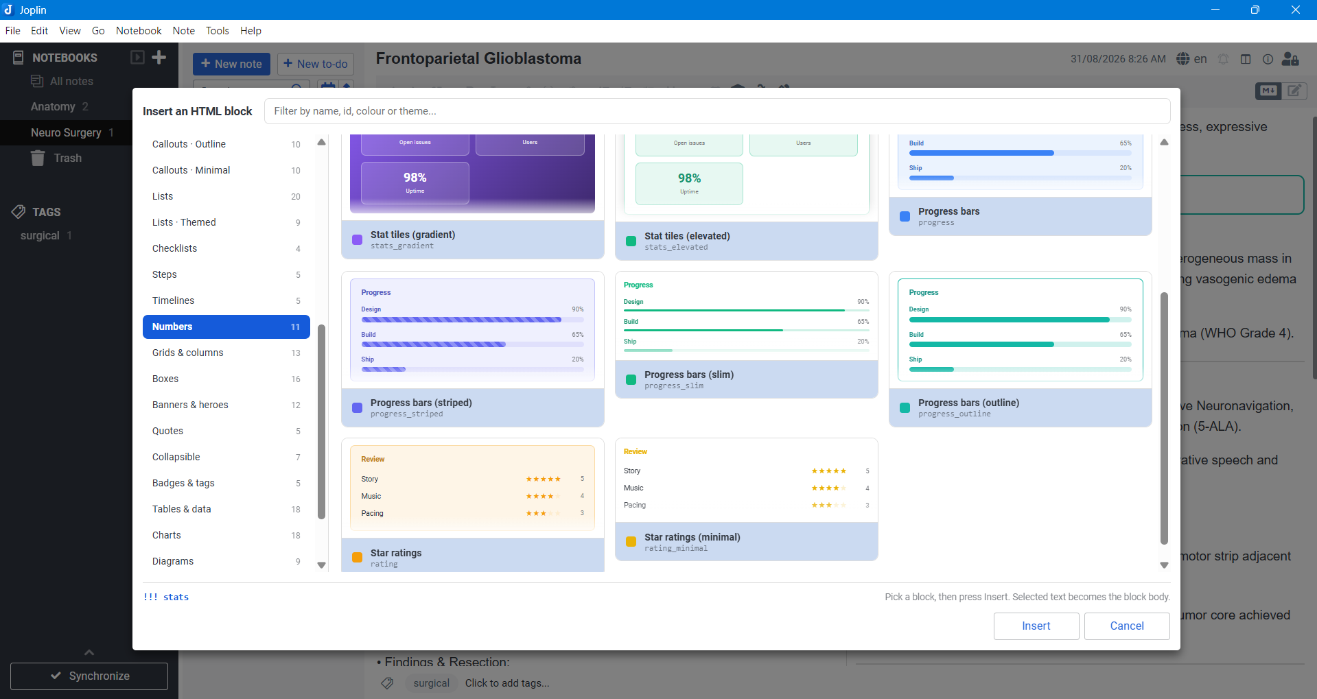
More of the picker: stat tiles, progress bars and ratings, tables and key/value data, collapsible sections and FAQs, and animations.
Search for HTML Blocks in Tools → Options → Plugins, or install
com.madusanka.htmlBlocks.jpl with Install from file. Requires Joplin 3.0 or
later on desktop.
User manual (PDF) - 89 pages covering every
block, with a rendered preview beside the markdown for each one. It is generated
by the plugin's own renderer via npm run manual, so the previews always match
what Joplin actually draws.
!!! <type> <optional title>
<contents>
!!!->
!!! followed by a block type. A type always starts with
a letter, which is what keeps it from being confused with a closing fence.!!!->, !!!<-, or just !!!.Most blocks treat their contents as ordinary markdown. The list-like ones
(list_*, steps, timeline, stats, progress, rating, keyvalue,
table_*, pros_cons, faq_*, features_*, chat, badges, chart_*,
flow*, tree*, buttons*) treat one line as one item instead, and split
fields on :::
!!! steps How it works
Install it :: Download and run the installer
Configure it :: Open the settings screen
Use it :: You are done
!!!->
Grids split their cells on a --- line:
!!! grid_2 Two things
**Left**

Left hand contents
---
**Right**

Right hand contents
!!!->
Three ways, whichever suits you:
The picker shows each block as a live preview rather than a name: every tile is the real block, drawn by the same renderer the note viewer uses, so what you see in the dialog is what lands in the note. It opens on the blocks you reached for most recently, and the sidebar walks the categories. Typing filters across every category at once - by name, id, colour, mode or theme - the arrow keys walk the grid, and a double click inserts straight away.
Previews can be turned off in Tools → Options → HTML Blocks if you would rather have a plain list of names.
Tools → HTML Blocks → Insert cheat sheet drops one example of every single block type into the current note, which is the quickest way to see what they all look like.
There are too many block types to list one by one here - the picker shows every one of them as a preview, and the user manual pairs each one with its markdown. The categories are:
| Category | Blocks | For example |
|---|---|---|
| Cards | 21 | card_light_blue, card_blue, card_indigo |
| Cards · Solid | 12 | card_solid_blue, card_solid_indigo, card_solid_violet |
| Cards · Outline | 12 | card_outline_blue, card_outline_indigo, card_outline_violet |
| Cards · Gradient | 12 | card_gradient_blue, card_gradient_indigo, card_gradient_violet |
| Cards · Elevated | 12 | card_elevated_blue, card_elevated_indigo, card_elevated_violet |
| Cards · Glass | 8 | card_glass_blue, card_glass_violet, card_glass_pink |
| Cards · Neon | 8 | card_neon_blue, card_neon_violet, card_neon_pink |
| Cards · Minimal | 8 | card_minimal_blue, card_minimal_violet, card_minimal_pink |
| Cards · Ribbon | 8 | card_ribbon_blue, card_ribbon_violet, card_ribbon_pink |
| Cards · Dashed | 8 | card_dashed_blue, card_dashed_violet, card_dashed_pink |
| Cards · Underline | 8 | card_underline_blue, card_underline_violet, card_underline_pink |
| Admonitions | 12 | note, warning, danger |
| Callouts | 28 | callout_info, callout_tip, callout_warning |
| Callouts · Solid | 10 | callout_info_solid, callout_tip_solid, callout_note_solid |
| Callouts · Outline | 10 | callout_info_outline, callout_tip_outline, callout_note_outline |
| Callouts · Minimal | 10 | callout_info_minimal, callout_tip_minimal, callout_note_minimal |
| Lists | 20 | list_style1, list_pills, list_ranked |
| Lists · Themed | 9 | list_style1_solid, list_style2_solid, list_style3_solid |
| Checklists | 4 | list_check, checklist_outline, checklist_boxed |
| Steps | 5 | steps, steps_solid, steps_outline |
| Timelines | 5 | timeline, timeline_solid, timeline_outline |
| Numbers | 11 | stats, progress, rating |
| Grids & columns | 13 | grid_2, grid_3, columns_2 |
| Boxes | 16 | box_plain, box_terminal, note_paper |
| Banners & heroes | 12 | banner, hero, section_title |
| Quotes | 5 | quote_box, quote_pull, quote_card |
| Collapsible | 7 | details, details_open, faq_list |
| Badges & tags | 5 | badges, badges_tags, badges_square |
| Tables & data | 18 | keyvalue, table, table_matrix |
| Charts | 18 | chart_column, chart_pie, chart_line |
| Diagrams | 9 | flow, flow_down, tree |
| Buttons & links | 7 | buttons, buttons_pill, buttons_cta |
| ASCII & text art | 17 | ascii_art, big_text, text_gradient |
| Animations | 15 | anim_fade, anim_typewriter, anim_marquee |
Most ids read the way they look: <family>_<theme>_<colour>. The short,
memorable ones are aliased - hint, caution, error, todo, summary,
collapse, spoiler, kv, tags, terminal and friends all work as types.
Line formats. Blocks that take one line per item split their fields on :::
| Type | Line format |
|---|---|
steps |
title :: description |
timeline |
when :: title :: description |
stats |
value :: label |
progress |
label :: 70 or 7/10 or 70% |
rating |
label :: 4 (out of five) or 8/10 |
keyvalue |
key :: value |
table |
cell :: cell :: cell - the first line is the header row |
pros_cons |
+ a good thing / - a bad thing, :: Left :: Right renames the columns |
faq_list |
question :: answer |
features_2 |
🚀 title :: description |
chat |
who :: message, a leading > forces the message right |
badges |
split on commas and newlines |
list_* |
one item per line; [x] / [ ] for checkboxes, two spaces to nest |
grid_*, columns_* |
markdown cells split on a --- line |
chart_* |
label :: value - 1,200, 1.2k, 85% and 7/10 all read as numbers |
flow* |
node :: caption - one node per line, arrows drawn between them |
tree* |
one entry per line, two spaces to nest, name :: note |
buttons* |
label :: https://... :: note; a leading emoji becomes the icon |
table_matrix |
yes / no / partly in a cell become a tick, a cross or a tilde |
ascii_* |
kept exactly as typed - every space and blank line survives |
big_text |
one line of text per banner, spelled out in block letters |
If your notes already use the Admonition markdown extension, they render here unchanged - no rewriting, and no need to keep both plugins installed.
The fence syntax was already the same (!!! type Optional title ... !!!), and
its twelve types are first-class blocks here, styled to match: the
mkdocs-material
colours, the same title-bar emoji, the same accent rule down the left edge.
note |
abstract |
info |
tip |
success |
question |
warning |
failure |
danger |
bug |
example |
quote |
!!! warning Watch out
Renders exactly as it did under the old plugin.
!!!
Two small differences, both cosmetic:
Note rather than note.These twelve are separate from this plugin's own callout_* family, which keeps
its rounded, tinted look and its own set of types - use either, or both. Two ids
moved to make room: !!! quote is now the admonition, and the plugin's original
quote block is quote_box (or blockquote).
In the markdown editor the fences are coloured with the block's own colour, the lines inside get a tinted background and a coloured left bar, and nested blocks are indented. An unknown block type is underlined in red so typos are obvious before you switch to the viewer.
Turn it off in Tools → Options → HTML Blocks if you'd rather not have it.
Every block derives all of its colours from one base colour, mixed against the
current Joplin theme with color-mix(). That means the blocks follow your theme
automatically - no separate dark mode stylesheet, and no hard-coded white
backgrounds glaring at you in dark mode. On renderers without color-mix()
support the blocks fall back to plain outlines.
To restyle a block yourself, target it in your userstyle:
/* every block carries its type in a data attribute */
.jhtml[data-jhtml-type="card_light_blue"] { --jh-color: #ff00aa; }
tools/block-families.js is the source of truth. It describes blocks by family -
a family being one shape crossed with a set of colours and themes - and
npm run blocks expands it into src/blocks/blocks.json, which is what ships.
Edit the families, never the JSON: the JSON is regenerated (and your edits lost)
on the next build.
{ id: 'card_brown', label: 'Brown card', category: 'Cards', mode: 'card',
	color: 'brown', titleHint: 'Card title', bodyHint: 'Card contents' },
...then npm run dist. The new type is immediately available in the parser, the
viewer stylesheet, the editor highlighter, the menus and the picker dialog -
there is nowhere else to register it. The generator refuses to write a registry
with a duplicate id or alias, an unknown mode or a missing colour, so a mistake
in a family fails the build rather than shipping.
A block is a mode (which renderer draws it) plus a theme (what the chrome around it looks like). The two are independent - any theme works on any mode:
mode: card, callout, plain, quote, details, grid, list,
steps, timeline, stats, progress, rating, badges, keyvalue,
table, compare, faq, feature, chat, chart, flow, tree,
buttons, art, bigtext.theme: soft (the default), solid, outline, gradient, elevated,
glass, neon, minimal, ribbon, dashed, underline, admonition.The remaining fields (icon, defaultTitle, variant, chart, animation,
listStyle, ordered, columns, bare, open, aliases) are documented in
src/blocks/types.ts. chart picks which chart a chart block draws (column,
bar, pie, donut, line, area, gauge, stack) and animation adds one
of the motion presets - all of which switch themselves off again for readers with
prefers-reduced-motion set.
npm install
npm run dist
That regenerates the stylesheets, compiles everything and writes
publish/com.madusanka.htmlBlocks.jpl.
To install the built plugin: Tools → Options → Plugins → the gear icon →
Install from file, and pick the .jpl.
For development, point Tools → Options → Plugins → Advanced → Development
plugins at this folder (H:\Projects\joplin_html) and restart Joplin. Joplin
then loads dist/ directly, so a npm run dist plus a restart picks up your
changes.
src/
  index.ts                  main script: settings, commands, menus, picker dialog
  picker.ts                 builds the picker dialog's HTML
  blocks/
    blocks.json             the registry - generated, every block type lives here
    types.ts                registry types
    syntax.ts               the fence grammar, shared by viewer and editor
    render.ts               all HTML generation, shared by viewer and picker
    preview.ts              the picker's thumbnails, on top of render.ts
    viewerCss.ts            generated - the viewer stylesheet, as a string
    index.ts                lookup helpers and the snippet builder
  markdownItPlugin/         markdown-it content script (the viewer)
  codeMirrorPlugin/         CodeMirror 6 content script (the editor)
  dialog/                   assets for the block picker
tools/
  block-families.js         the block families - the source of truth
  generate-blocks.js        expands the families into blocks.json
  generate-styles.js        builds both stylesheets from the registry
  styles/                   hand written CSS the generator wraps
The picker's thumbnails go through blocks/render.ts, the same code the note
viewer uses, so a preview cannot drift away from what Joplin actually draws. The
generated viewer stylesheet is inlined into the dialog's HTML (as
blocks/viewerCss.ts) for the same reason: Joplin replaces a dialog's content
on every open, so the previews carry their own styling rather than depending on
a second file resolving inside the dialog frame.
src/blocks/blocks.json, src/blocks/viewerCss.ts,
src/markdownItPlugin/style.css and src/codeMirrorPlugin/style.css are
generated - edit tools/block-families.js and tools/styles/*.css instead.