![]()
![]()

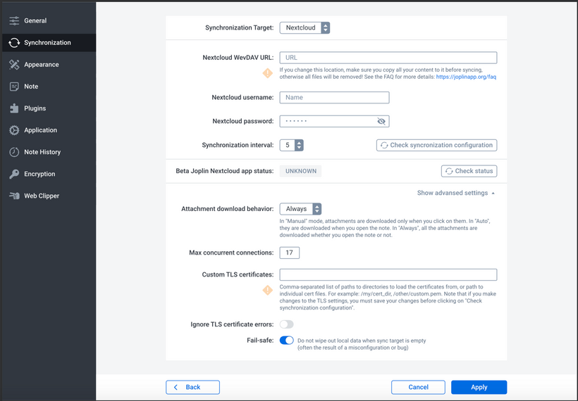
The design put the menu bar on the left, which I think makes sense, as it's consistent with the main screen UI. And I expect this bar will be the same colour as the main screen sidebar
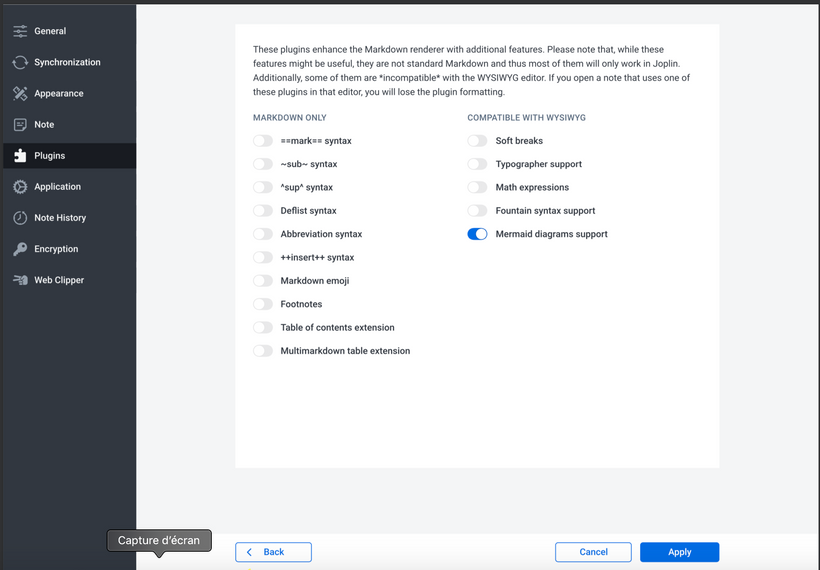
For checkboxes Serj used a toggle button, which actually makes it easier to align all the labels on the left (a checkbox with a label on the left looks strange) so I might go with it.
Otherwise the screens are relatively similar but tidier. If you have any suggestion on what could be changed, feel free to let me know.
Synchronisation config
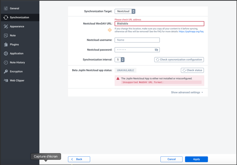
Synchronisation config (error messages)
Plugin config