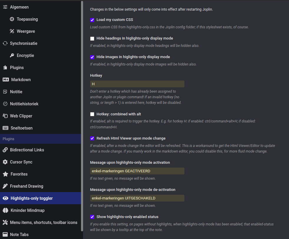
This plugin can be used to toggle between highlights-only display or complete text of a note
| Links: | |
|---|---|
| Maintainers: | smartscripter |
| Version: | 1.0.18 |
| Minimum app version: | 3.5 |
| Downloads: This version: | 46 |
| Last updated: | 2026-04-25T15:16:37Z |
.highlights-only p:not(:has(mark)), .highlights-only li:not(:has(mark)) {
  display: none;
}

.highlights-only p:has(mark) {
  margin: 1em .8em;
}

.highlights-only li:has(mark) p {
    margin: 0;
    padding: 0;
    text-indent: 0;
}

.highlights-only li:has(mark) {
    list-style: inside;
}

.highlights-only mark {
    display: block;
    border-radius: 4px;
    padding: .5em;
    background: transparent;
    color: rgb(254, 235, 201);
}

.highlights-only li mark {
    display: inline-block;
}

.highlights-only mark a {
    color: orange;
    font-weight: normal;
}

.highlights-only span.hide-around-highlight, .highlights-only hr {
    display: none;
}

/* Status indicator */
.highlights-only::before {
    content: "🖍️️ highlights-only mode enabled...";
    display: block;
    background: lightblue;
    color: black;
    padding: 4px 8px;
    font-weight: bold;
    margin-bottom: 11px;
    text-align: center;
    border-radius: 4px;
}
.highlights-only p:not(:has(mark)), .highlights-only li:not(:has(mark)) {
  display: none;
}

.highlights-only p:has(mark) {
  margin: 1em .8em;
}

.highlights-only li:has(mark) {
  padding: 0;
  margin: 0;
  list-style: inside;
  text-indent: 0;
}

.highlights-only li:has(mark) p {
    margin: 0;
    padding: 0;
    text-indent: 0;
}

.highlights-only li::before {
    content: none !important;
    padding-right: 0 !important;
    width: 0 !important;
}

.highlights-only mark {
    display: block;
    border-radius: 4px;
    padding: .5em;
    background: orange;
    color: black;
}

.highlights-only li mark {
    display: inline-block;
}

.highlights-only mark a {
    color: maroon;
    font-weight: normal;
}

.highlights-only span.hide-around-highlight {
    display: none;
}

/* Status indicator */
.highlights-only::before {
    content: none; /* or e.g.: content: "🖍️ highlights-only mode enabled...";*/
    display: block;
    background: lightblue;
    color: black;
    padding: 0;
    font-weight: bold;
    margin-bottom: 0;
    text-align: center;
    border-radius: 4px;
}
.highlights-only-enabled::before {
    content: "🖍️️ no (substantial) highlights below...";
    display: block;
    background: lightblue;
    color: black;
    padding: 4px 8px;
    font-weight: bold;
    margin-bottom: 11px;
    text-align: center;
    border-radius: 4px;
}
.highlights-only blockquote mark {
    background: tomato;
    color: black;
}

.highlights-only blockquote:has(mark) {
    opacity: 0.7;
}

.highlights-only blockquote mark a, .highlights-only blockquote mark a:visited {
    color: #fff176;
}