Aller au contenu principal

· Une minute de lecture

One feature that may have gone a bit unnoticed in recent versions is the ability to change the application layout. It is mainly aimed at plugins, so that they can create a panel anywhere, and you can then move it wherever you want, but it can also be used to re-arranged existing application components.

For example, you can put the note list below the sidebar, to have more space for the text editor, move the sidebar to the right of the application, etc.

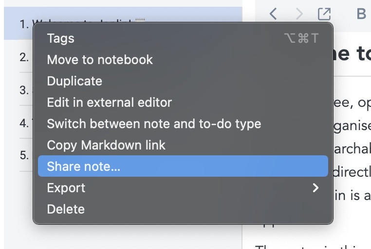
To begin changing the application layout, click on "Change application layout" from the View menu:

This will put the app into a special mode, from which you can move the side bar, note list and text editor around. You do so by pressing on the arrow keys:

For example, pressing the left arrow on the note list would move it to the left, just below the sidebar:

Once you're done modifying the layout, press the "Escape" key to exit.

· 2 minutes de lecture

The plugin system has been part of Joplin since the previous version, however it was still a bit unstable. In the latest version we're getting a bit closer to production-ready state. The plugin API in particular has been significantly expanded, based on the developer feedback, so that more types of plugin are possible now, and indeed a few plugin concepts have started appearing on the forums. In particular all this could be done now:

  • Access notes, folders, etc. via the data API
  • Add a view to display custom data using HTML/CSS/JS
  • Create a dialog to display information and get input from the user
  • Create a new command and associate a toolbar button or menu item with it
  • Get access to the note currently being edited and modify it
  • Listen to various events and run code when they happen
  • Hook into the application to set additional options and customise Joplin's behaviour
  • Create a module to export or import data into Joplin
  • Define new settings and setting sections, and get/set them from the plugin
  • Create a new Markdown plugin to render custom markup.
  • Create an editor plugin to modify low-level the behaviour of the Markdown editor (CodeMirror)

Plugin JPL format and configuration screen

The plugin configuration screen has also been updated so that it's possible to import the new JPL (Joplin PLugin) format and to enable/disable as well as uninstall plugins.

What's next?

It is now possible to create new plugins, package them into the JPL format, and to install them into the app.

The last piece missing is a way to discover and share plugins, and a way to update them easily, basically what we need is an online package manager. It is not clear yet how this is going to be done, but one idea would be to have a GitHub repository where anyone could submit or update a plugin, then the app would connect to that repository to make it easy to install new plugins. This is just an idea at this point though, and if you have any suggestion on other ways it could be done, feel free to let me know. A discussion about it has been started in the forum.

· 2 minutes de lecture

With 340 votes on GitHub, spell checker support was the most requested feature and is now finally available in Joplin! This was always tricky to add due to the custom editors (Rich Text and Markdown) we use, but thanks to the recent improvements in the Electron framework and to Caleb John's work on the Markdown editor it is now possible.

It should be working fine in both editors however it is currently considered Beta for the Markdown Editor because to enable the feature we had to use a special mode which in the past caused various issues. Now it seems to work well, at least we haven't noticed any bug so far, but please keep that in mind. If you notice any issue let us know in the forum.

Enabling the spell checker

To enable or disable the spell checker, simply click on the top right hand globe icon (or select Spell Checker in the Tools menu), then select the language you would like to use. Since the list of languages can be huge on certain operating system, the latest selected languages also appear just below the "Use spell checker" checkbox.

Activating the Markdown Editor Beta spell checker

By default, the spell checker is not activated in the Markdown editor even if "Use spell checker" is ticked because it is currently in Beta state. To enable it, go to the General settings, open the Advanced Settings, and select "Enable spell checking in Markdown editor". As mentioned above, we think the feature is stable and haven't found any bug with it, however if you notice anything please let us know.

· Une minute de lecture

I'm still trying to get a sense of what sharing and collaboration features would be useful in Joplin. By this mean any way to share a note with someone else or have multiple users collaborate on the same set of notes or notebooks.

If a feature like this might interest you, I'd be helpful if you could describe: how would you use it? How would you expect it to work?

All this might not be implemented right away, but it will inform how the development should happen for example by making sure that even if a feature can't be done now the software is done in such a way that it's possible to add it later on.

Any idea or suggestion is welcome!

· 3 minutes de lecture

In this series of posts about version 1.1, we'll introduce another feature by one of our GSoC candidates, Anjula. Anjula developed over the past few months a system to allow configuring the keymap shortcuts, and created a nice editor for it.  Here is what he has to say:


Joplin desktop application supports keyboard shortcuts to a certain  degree. However, there wasn't an option for users to configure keyboard  shortcuts according to their preferences. My project was to implement a  keyboard shortcut editor along with the necessary integration.

Custom keyboard shortcuts would be a great addition for all Joplin  users including power users and those who are migrating to Joplin from  other note-taking applications. People also do not have the same  keyboard layout; not everyone has F6 necessarily. It would solve  conflicts between different preferences of workflows, and increase  discoverability for all keyboard shortcuts.

KeymapService builds an in-memory keymap based on the default keymap  configuration. The default keymap configuration may vary from platform  to platform. Essentially, the in-memory keymap binds a keyboard shortcut  for some command of Joplin. Clients of KeymapService may obtain the  keyboard shortcuts for some commands, and/or alter the keymap via the  provided methods.

KeymapService also allows altering the keymap via a keymap file,  which is located in the profile directory. Contents of this keymap file  will take higher priority than the default keymap configuration, and  will replace the default keyboard shortcuts.

It is guaranteed that the keymap always stays pristine with proper validation.

Keyboard shortcut editor with the necessary functionality to alter the keymap

Depending on the interfaces of KeymapService, the Keyboard shortcut editor allows the user to,

  • View all the available commands and their respective keyboard shortcuts
  • Change, or disable a keyboard shortcut for some command
  • Restore a keyboard shortcut to its default value
  • Export all changes to a keymap file (in JSON format)
  • Import changes from an exported keymap file
  • Perform a simple search to locate some shortcut

Changes performed to the keymap will be reflected immediately in the  application user-interface as well as in the keymap file located in the  profile directory. The editor will also perform continuous validation to  ensure that the keymap will not enter a dirty-state. For example, it  won't allow the user to use the same shortcut for two or more commands.

The complete report with details of code contributions can be found here.

· 3 minutes de lecture

In this series of posts, I will introduce the changes that are coming in version 1.1 (which in fact is already available as a pre-release).

For this first feature, I will let Naveen, our GSoC candidate, present it. Naveen has made an excellent job implementing various search engine features, including advanced filters, support for Okapi BM25 scoring algorithm, and fuzzy search. Here is what he has to say:

What got done

The project consisted of three parts:

  1. Make search better by introducing additional search filters. (e.g., tags, notebook, type)
  2. Make the ranking of search results better by implementing the Okapi BM25 relevance function.
  3. Make fuzzy search possible.

Code contributions

  1. All: Add search filtersJoplin's search had been using the Full-Text Search(FTS) offered by  SQLite directly. So though it was fast, it was not versatile. For  example, we can't restrict the search scope to a particular notebook or  search based on tags.The current search implementation fixes most of these problems. It  provides a better abstraction over FTS, supporting many new filters. The  documentation for the new search filters can be found here.
  2. All: Weigh notes using Okapi BM25 scoreJoplin used a ranking function based on the number of times the search query occurs in the note and how close they are.But there are better ways to rank notes, considering not just the  number of times a word appears, but how common it is. Words like "the"  is in most notes, while words like "zebra" are not common and should be  considered more relevant.The new search implementation uses Okapi BM25  as the ranking function. It ranks a set of documents based on the query  terms appearing in each document, regardless of their proximity.
  3. Desktop: Fuzzy searchWe've added support for fuzzy search. It doesn't replace the need to put  * at the end if you want to do a prefix search. But it does let you be a  bit more relaxed about the exact spelling. Searching for "tomatos" will  also give you results for "tomatoes". (This feature isn't released yet,  but will be soon)

It has been a pleasure working with Laurent and Caleb. They did an excellent job as mentors.

I hope these new features will be useful to many people. I plan to  continue as a member of the Joplin community and help in whatever way I  can.

· 6 minutes de lecture

The latest version of Joplin includes a mechanism to upgrade the structure of a sync target. When you startup the app you will be asked to upgrade before being able to sync. Once you start the process, the app will briefly display an information screen, upgrade the sync target, and then restart the app. You’ll then be able to sync with the new sync target format. That first upgrade is quite simple as the goal for now is to put the mechanism in place and verify that it works well.

From a user perspective this feature doesn’t do anything visible, although it caused some issues, so one might wonder why it’s even there. This post is meant to clarify this.

The structure of the sync target hasn’t really changed since the day Joplin was released. It works well however it has some shortcomings that should be fixed eventually for sync to remain performant.

There are also various improvements that could be made but were not previously possible due to the lack of an upgrade mechanism. I have listed below the 5 main limitations or issues with the current sync process and how they could be fixed:

No upper limit on the number of items

Joplin’s UI works well even with millions of notes, however the sync target will keep getting slower and slower as more files are added to it. File systems often have a limit to the number of files they can support in a directory. One user also has reached the limit of 150,000 items on OneDrive.

For now, this is not a big issue because most users don’t have millions of items, but as more web pages are being clipped (clipped pages often contain many small resources and images) and more note revisions are created (one note can have hundreds of revisions), this issue might start affecting more users.

One way to solve this issue would be to split the sync items into multiple directories. For example if we split the main directory into 100 sub-directories, it will be possible to have 15,000,000 OneDrive items instead of 150,000. Another way would be to support note archiving, as described below. How exactly we’ll handle this problem is still to be defined, but there are certainly ways.

Not possible to prioritise downloads

Currently, when syncing, the items are downloaded in a random way. So it might download some notes, then some tags and notebooks, then back to downloading notes, etc. For small sync operations it doesn’t matter, but large ones, like when setting up a new device, it is very inefficient. For example, the app might download hundreds of note revisions or tags, but won’t display anything for a while because it won’t have downloaded notebooks or notes.

A simple improvement would be to group the items by type on the sync target. So all notebook items together, all tags together, etc. Doing so means when syncing we can first download the notebooks, then the notes, which means something will be displayed almost immediately in the app, allowing the user to start using it. Then later less important items like tags or note revisions will be downloaded.

End-to-end encryption is hard to setup

Currently, the encryption settings is a property of the clients. What it means it that when you setup a new client, it doesn’t know whether the other clients use encryption or not. It’s going to guess more or less based on the data on the sync target. You can also force it to use encryption but this has drawbacks and often mean a new master key is going to be created, even though there might already be one on the sync target.

E2EE works well once it’s setup, but doing so can be tricky and possibly confusing - if you didn’t follow this guide to the letter, you might end up with multiple master keys, or sending decrypted notes to an encrypted target.

A way to solve this would be to make the E2EE settings a property of the sync target. Concretely there would be a file that tells if E2EE is enabled or not, and maybe some way to quickly get the master key. It would simplify setting up encryption a lot and make it more secure (because you won’t be able to send non-encrypted notes to an encrypted sync target). When you setup a new client, the client will know immediately if it’s an encrypted target or not and set the client accordingly.

Old notes that never change should be handled differently

It would be more efficient to treat old notes differently by allowing the user to “archive” them. An archived note would be read-only. Then one idea could be to group all these archived notes into a ZIP file on the sync target. Doing so means that the initial sync would be much faster (instead of downloading hundred of small files, which is slow, it will download one large file, which is fast). It would also make the structure more scalable - you could keep several years of archived notes on the sync target while keeping sync fast and efficient.

The resource directory should be renamed

The folder that contains file attachments is named “.resources” on the sync target. This causes troubles because certain platforms will hide directories that start with dot “.”, and perhaps they will be excluded from backup or skipped when moved somewhere else. Being able to upgrade the sync target means we can rename this folder to just “resources” instead.

Conclusion

That’s obviously a lot of possible improvements and it won’t be done overnight, but having the sync upgrade mechanism in place means we can start considering these options. Some of these, such as renaming the “resources” dir are simpler and could be done relatively soon. Perhaps other more complex ones will be group within one sync target upgrade to minimise disruption. In any case, I hope this clarifies the reason for this recent sync upgrade and that it gives some ideas of what to expect in the future.

· Une minute de lecture

The design put the menu bar on the left, which I think makes sense, as it's consistent with the main screen UI. And I expect this bar will be the same colour as the main screen sidebar

For checkboxes Serj used a toggle button, which actually makes it easier to align all the labels on the left (a checkbox with a label on the left looks strange) so I might go with it.

Otherwise the screens are relatively similar but tidier. If you have any suggestion on what could be changed, feel free to let me know.

Synchronisation config

Synchronisation config (error messages)

Plugin config